About GenGen
GenGen, also known as Generous Generation, is a non profit whose mission is to provide a bridge of authentic generosity between Gen Z and other generations. They help other organizations by collaborating with artists to create stickers that are sold without a set dollar amount, to encourage giving from the heart. What is more important to GenGen is collaboration, sticker design campaigns, and emphasizing how one can donate, which is not just through money but also with time and resources.
THE DESIGN PROCESS
THE PROBLEM
Gen Z fails to understand the narrative and figure out how to donate
After meeting with the stakeholders I observed that the site isn’t communicating GenGen’s narrative strongly and their donation method isn’t effectively shown, which in return causes very little interaction on their website and very little contribution from those who want to donate.
THE SOLUTION
One of the main parts I focused on was the color of the site so that GenGen’s mission is more clearly stated. I communicated with my team members and decided to take a risk and change colors to help GenGen pass the color accessibility and help display GenGen mission more clearly to the target users.
Another area I chose to focus on was how the content was arranged on the website. The original website layout made it difficult for the users to find out GenGen’s primary mission as a NPO and how to support. From this, I created a new structure within the website that implemented a clearer hierarchy.
COMPETITIVE ANALYSIS
After conducting the interview with the stakeholders, I proceeded to analyze GenGen’s competitors to see what their strengths and weaknesses were. With this analysis, I was able to better understand the different approaches that the brands took in order to address a similar problem, and apply this information to help make the best decisions for GenGen’s website.
PERSONA
Through my secondary and primary research, I was able to get a clear picture of who GenGen’s target users are and created a persona that would accurately represent them - meet Sidney C! This persona continued to guide my decisions moving forward, making sure my design is centered on who our user Sidney is.
DESIGN
Understanding that design can impact the users experience on the website is key
Feelings of confusion came from a clutter of information spread all throughout the website. Thus, redesigning for a better narrative was key to helping users understand what GenGen’s current mission is and how they as users could make an impact. Based on the new site map below, I made my best assumptions to try to identify these other pain points that provided opportunities for my design.
SITE MAP
Focusing on the prioritized solutions, I created a site map to help define the overall structure of the content on GenGen’s website in a way that would be logical and easy to navigate for our users.
LOFI WIREFRAMING
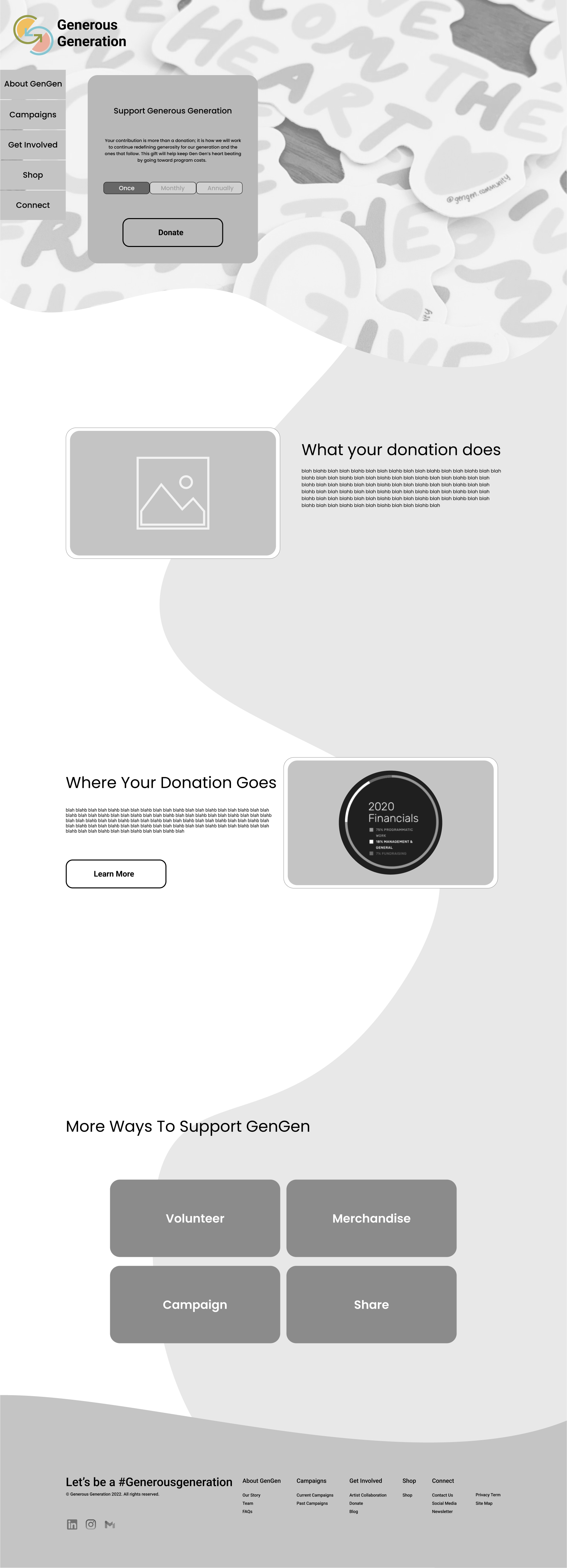
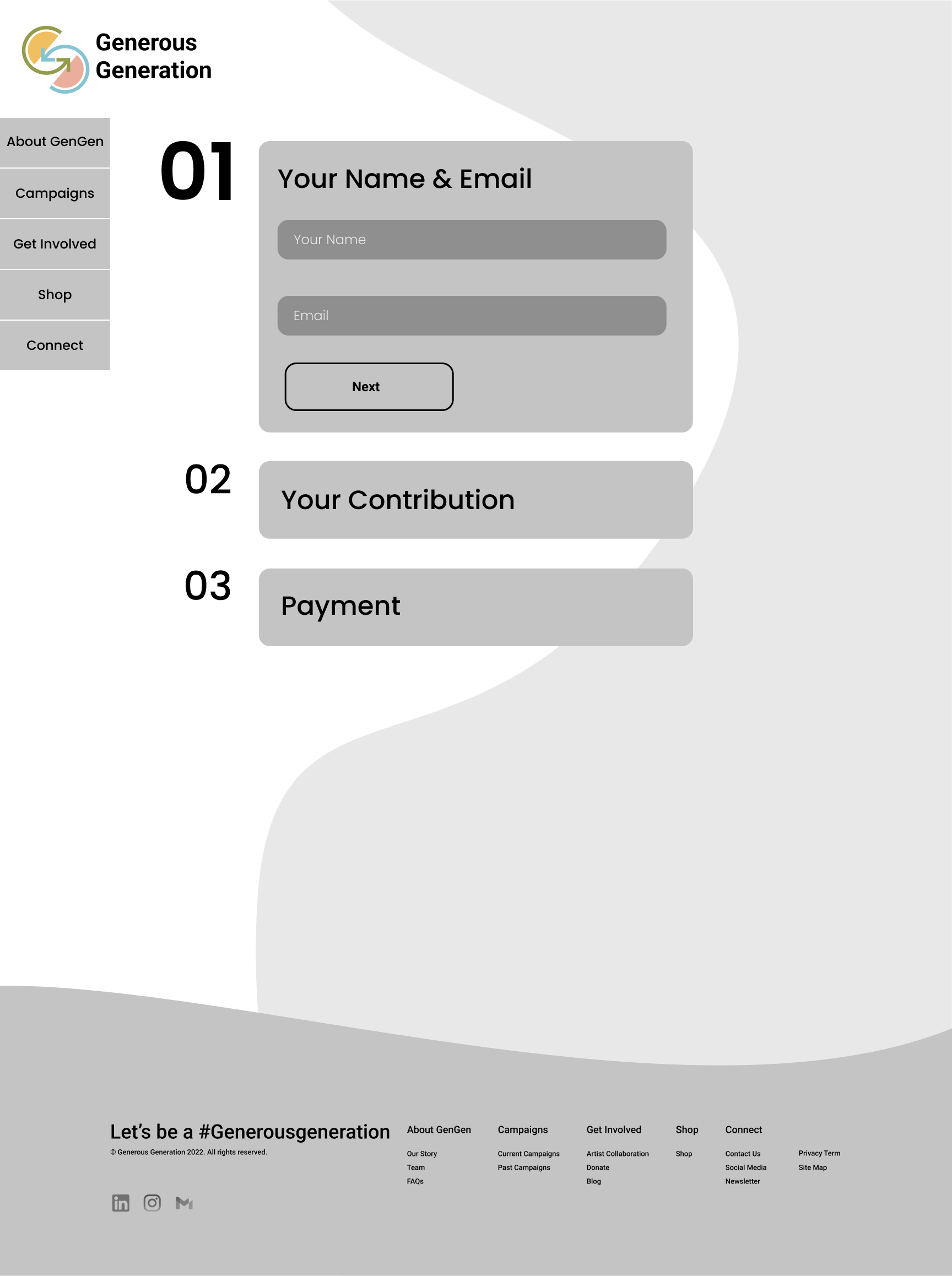
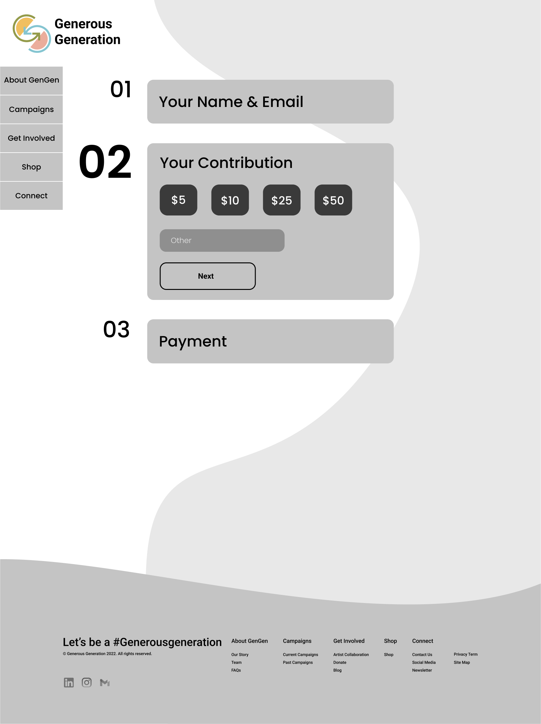
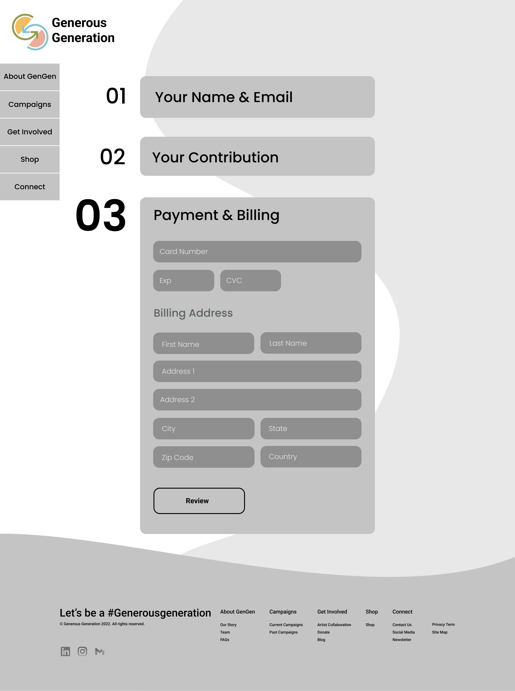
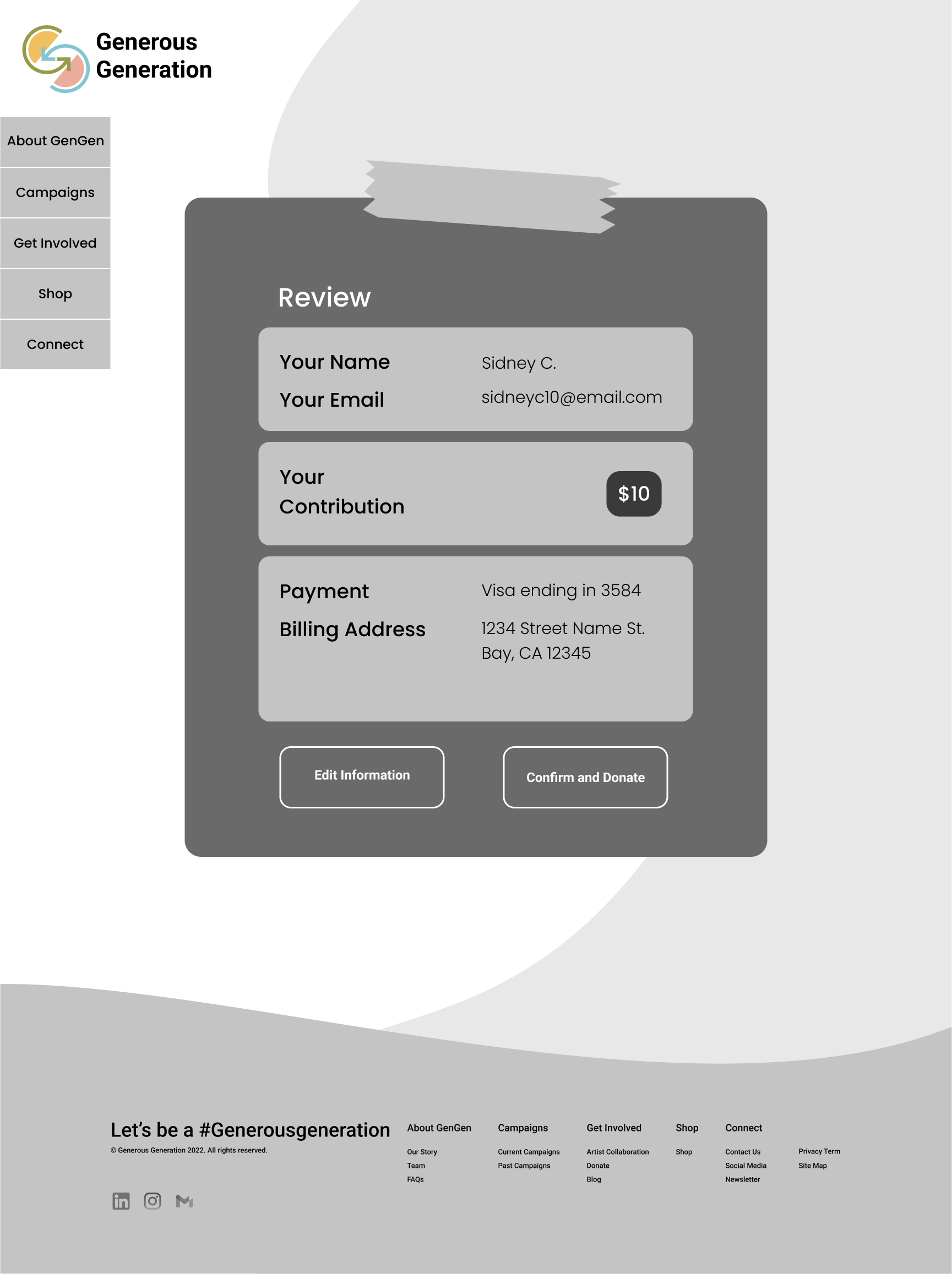
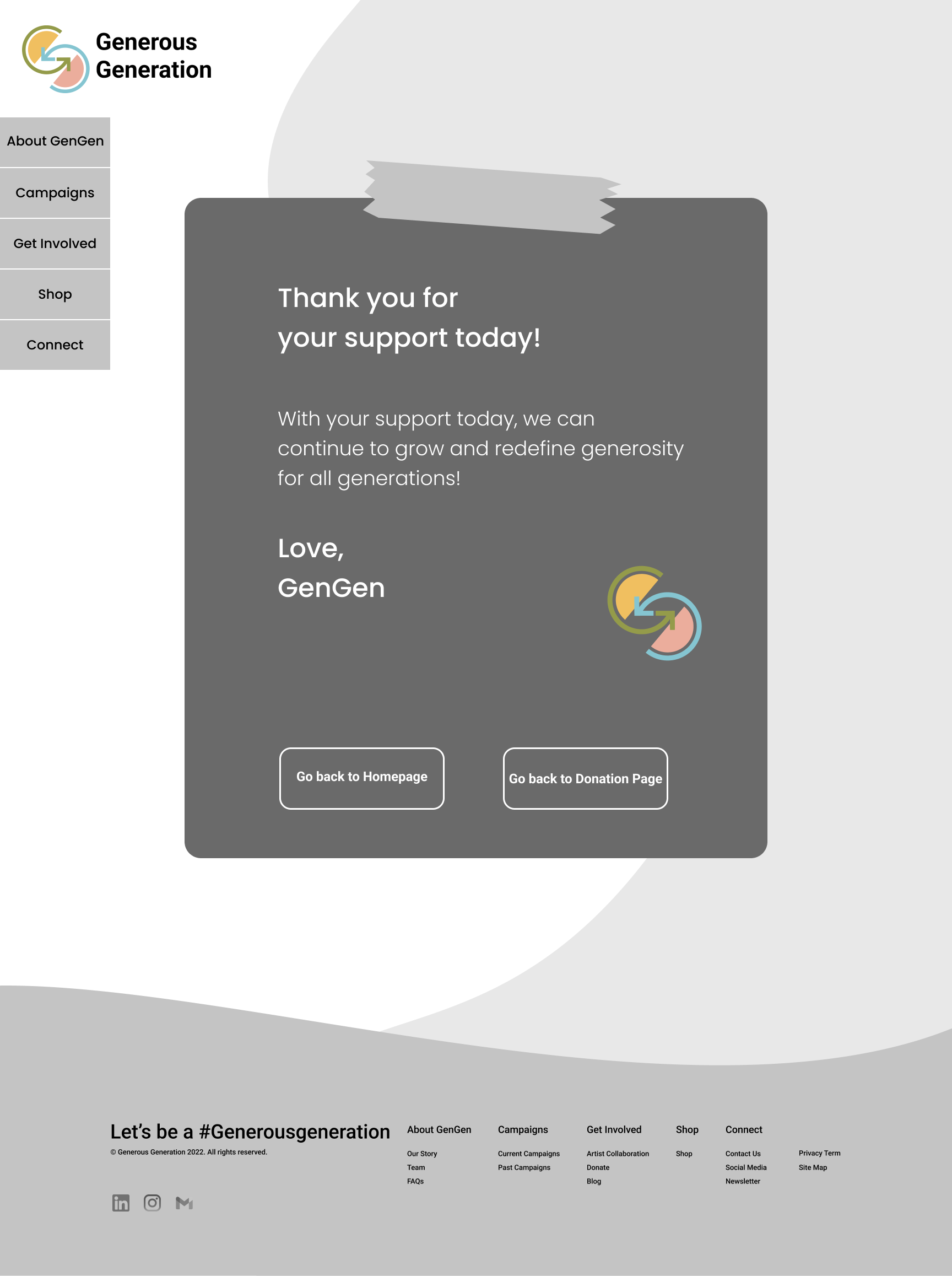
Taking what I’ve learned throughout my process to this point, I started to make decisions on how the content on GenGen’s website would be organized based on the project goals we want to meet.
FINAL VERSION
Final Prototype with added revisions
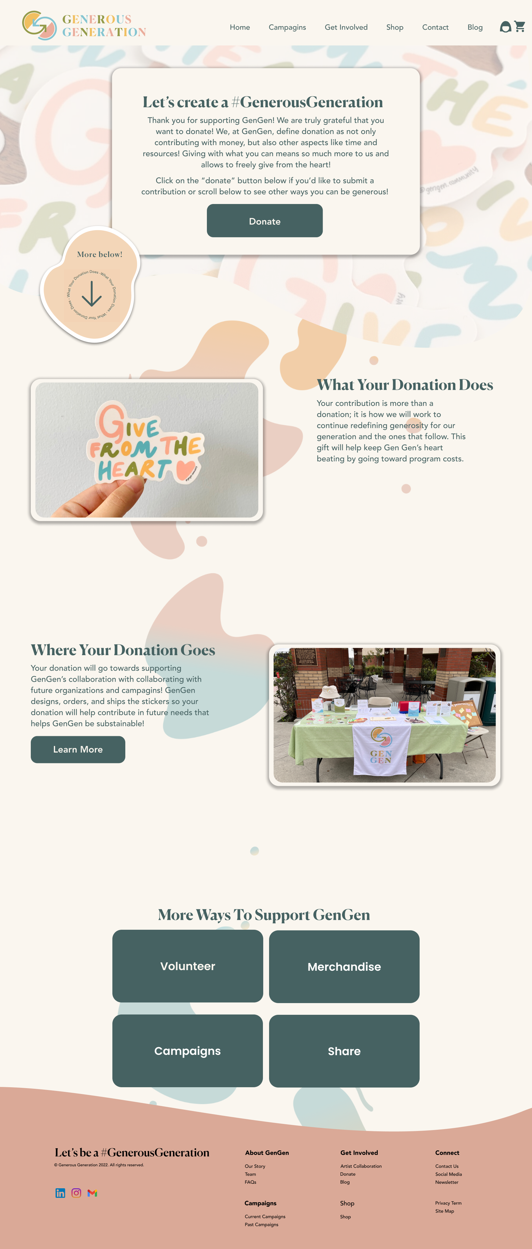
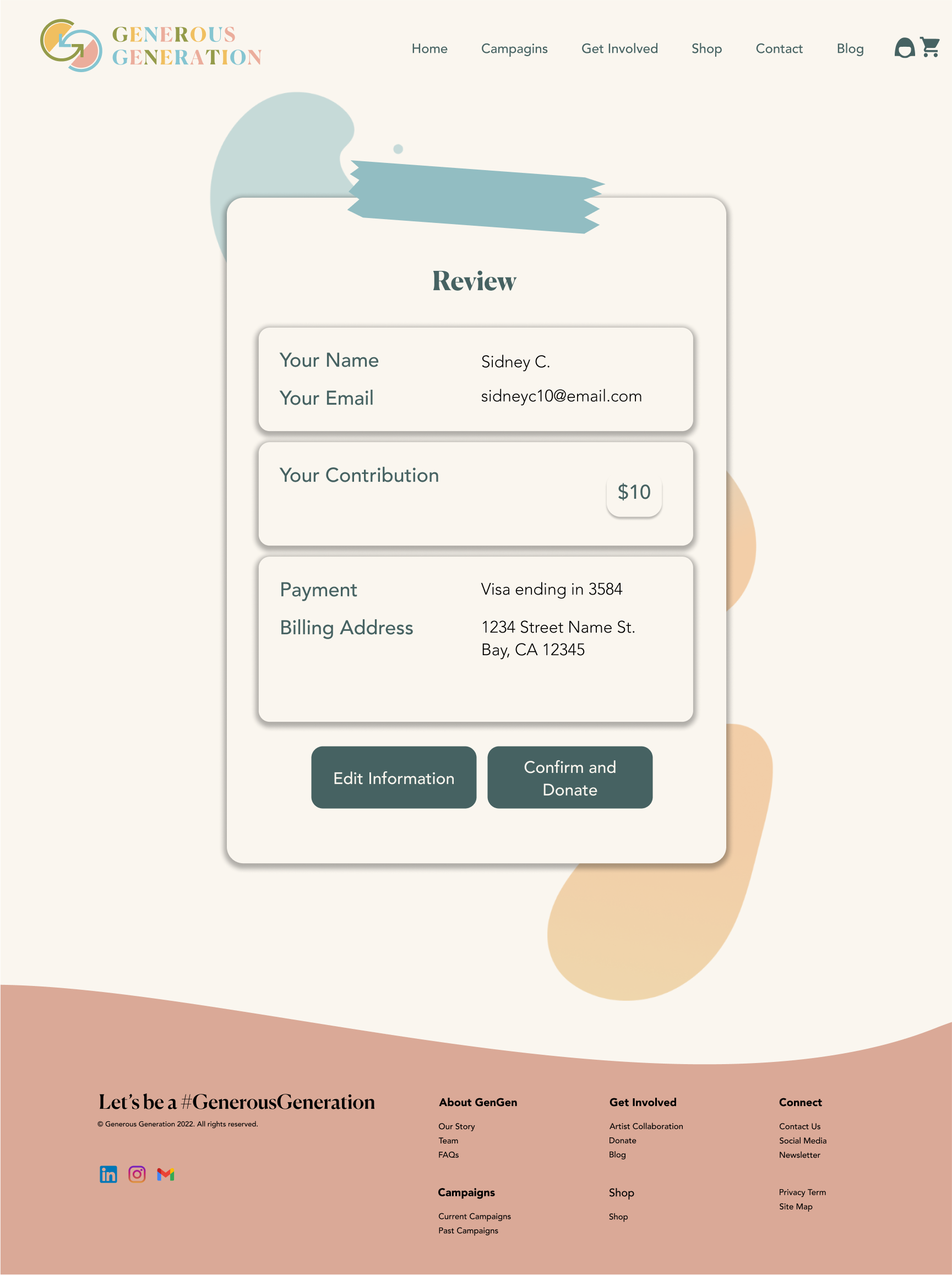
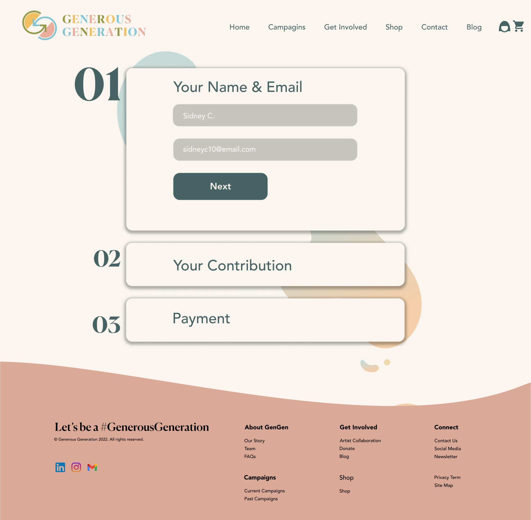
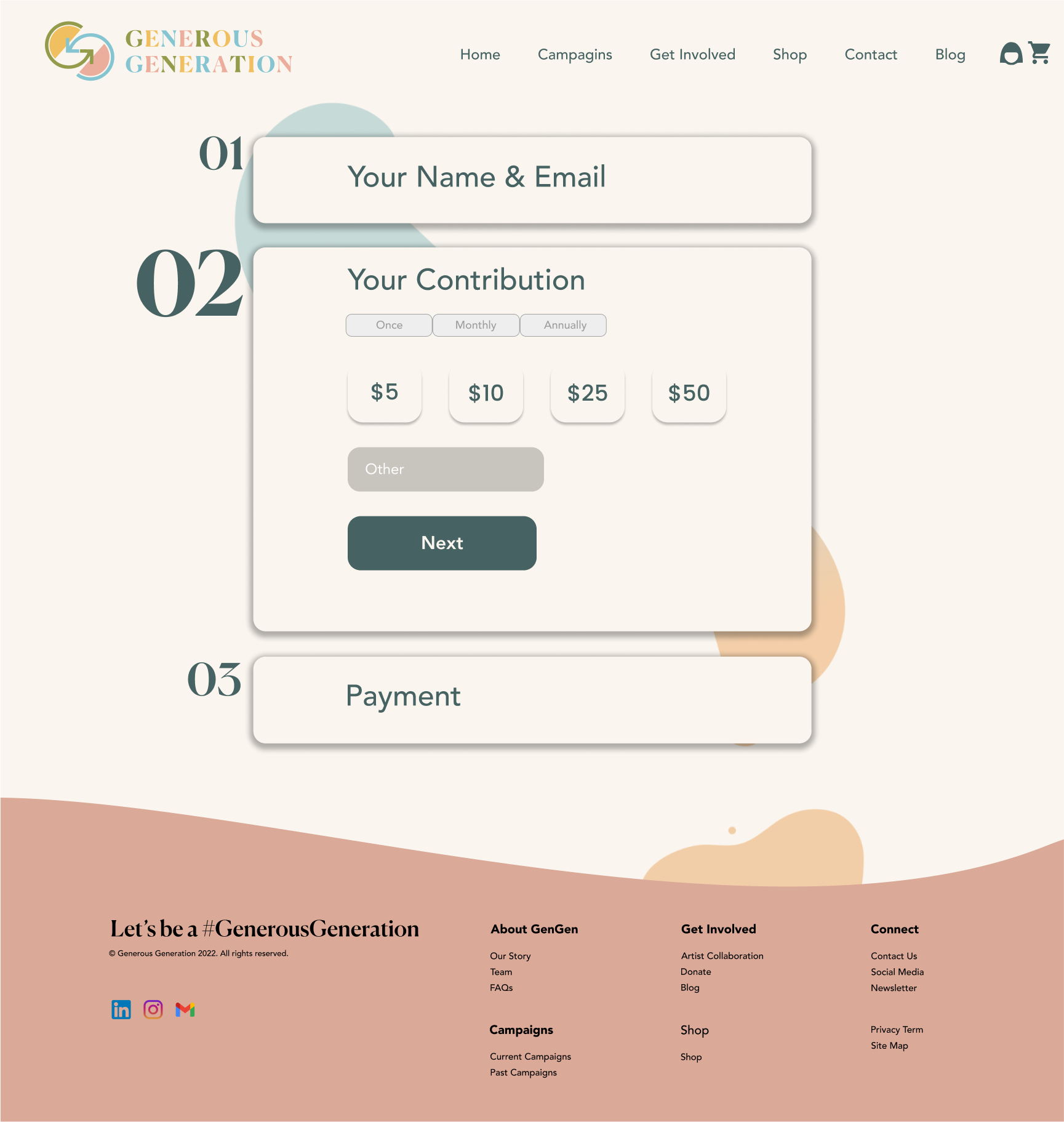
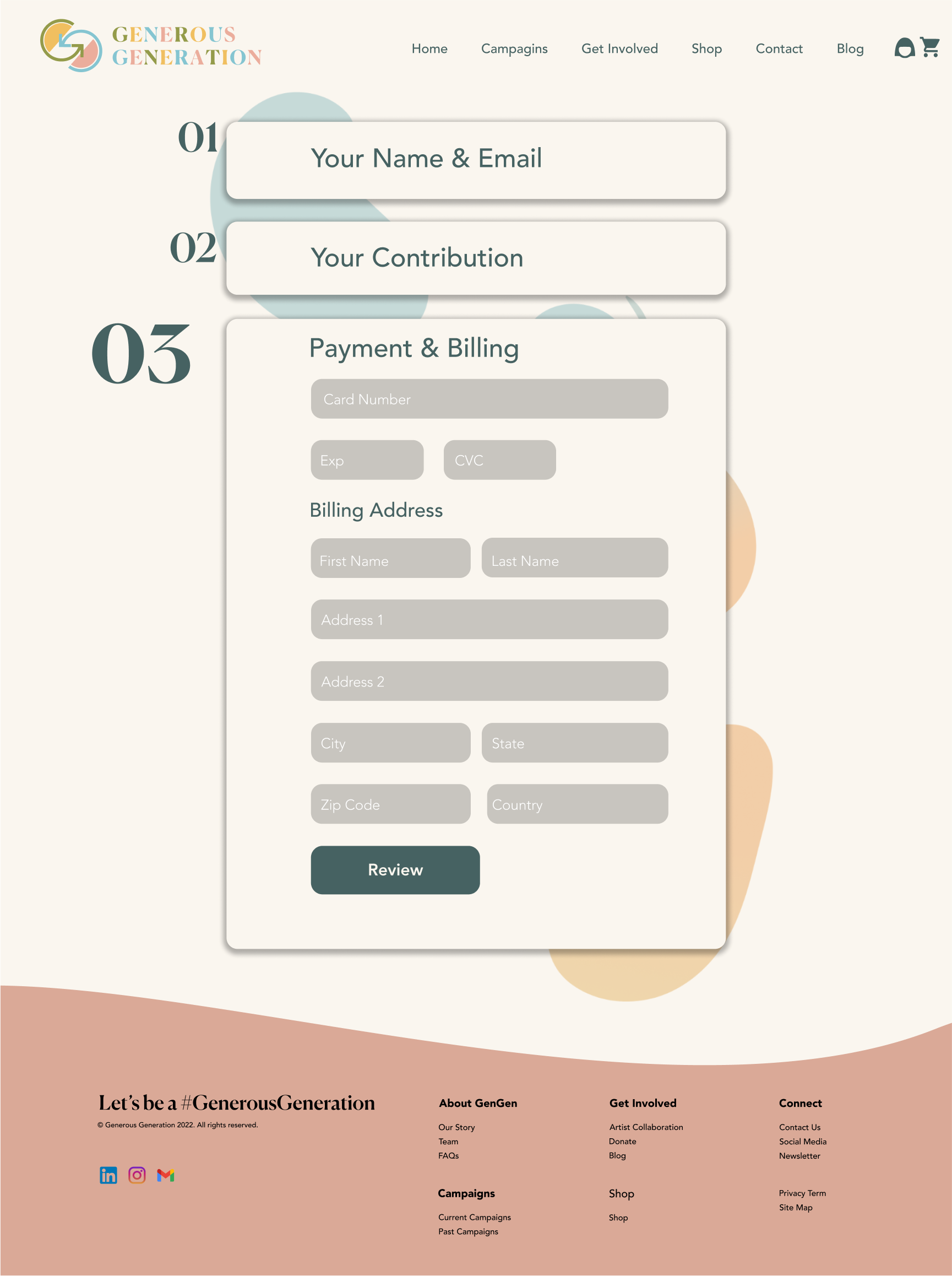
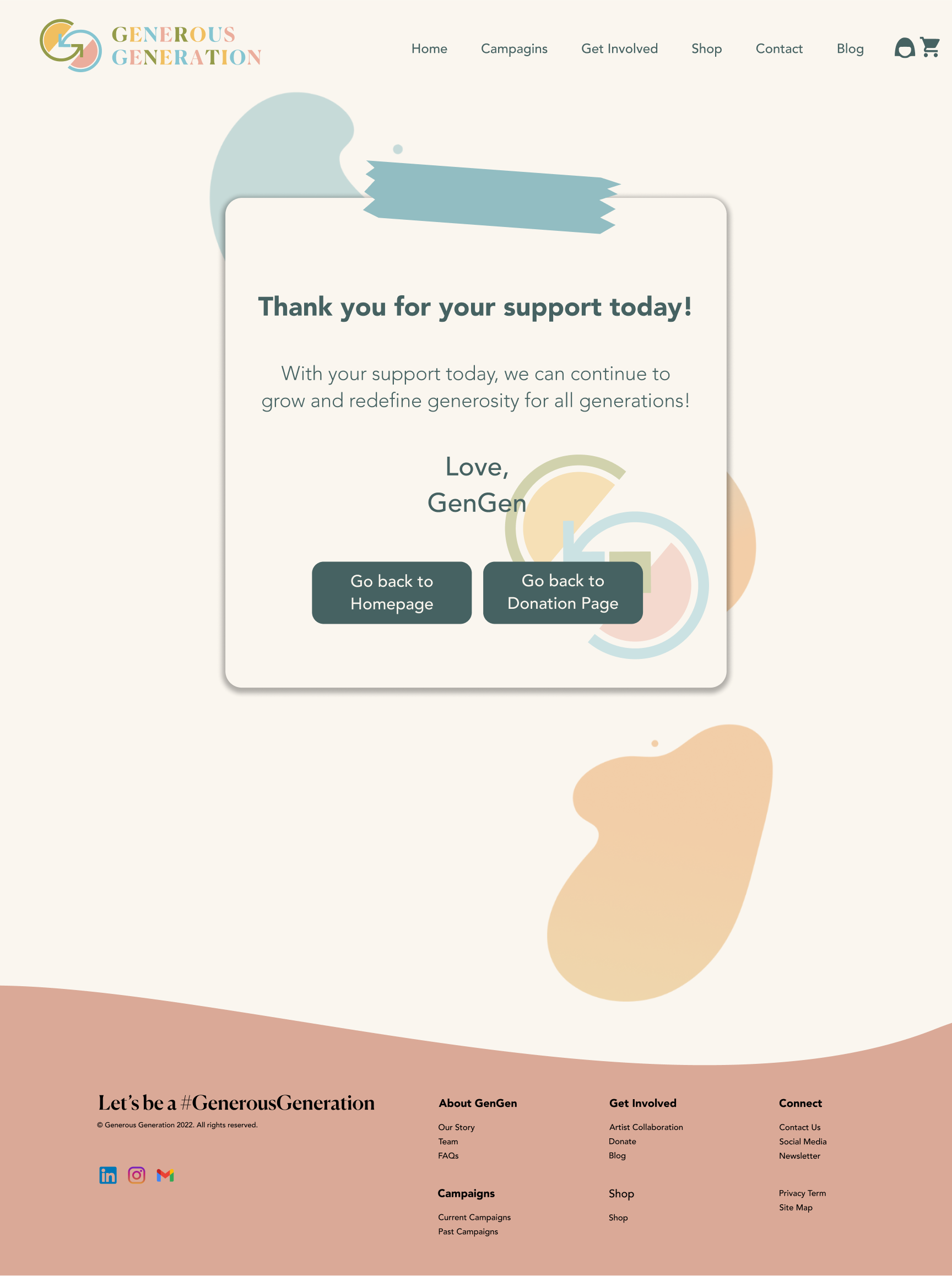
Incorporating visual elements in line with GenGen’s branding, I worked on the UI design of the website and created high-fidelity wireframes seen below! Please enjoy!
FULL FIGMA FILE: HERE
REFLECTION
What I’d do differently next time…
Gen Gen is one of my most challenging UX/UI projects! I’m so grateful to have been through the entire UX/UI process from start to finish. With that being said, here are a few things I’ve learned:
Communicate In the beginning stages, we explored so many different options while trying to take everything the stakeholders wanted into consideration. I found that in trying to do that, I was going crazy! So taking a step back, listening to what the stakeholders wanted and implementing those remarks slowly, and communicating that with the stakeholders, I found was a much smoother and easier time.
Focus from the beginning. I was so excited to start this project that I “may” have jumped the gun. Thinking of all the possibilities we could design and develop. Thinking at 100 mph early on got me into a lot of trouble and I had to stop and rethink things. I realized that taking baby steps from the beginning was the best way to develop this website to produce the best results.
Be insightful- not process-driven. Despite weeks of research + development, my first version of this case study was full of unnecessary text, and instead of tying everything into the bigger question- “so how does this fit into the bigger picture”? Hence, I made the decision to cut down the copy by more than 60% and focus more on the major points in this project. Hence, going forward we believe focusing more on the insights will improve my storytelling abilities for others.
You didn’t fail- you just found 100 ways that didn’t work. From noticing mistakes in our process to uncovering more foundational UX problems in our app, I am very thankful to have constantly asked for feedback from my peers, TA’s, and tutors/mentors. In the end, my partner and I pushed to have the app be as amazing as we could have ever imagined!


